-
Global
-
Europe
-
Asia and Pacific
-
North America
News
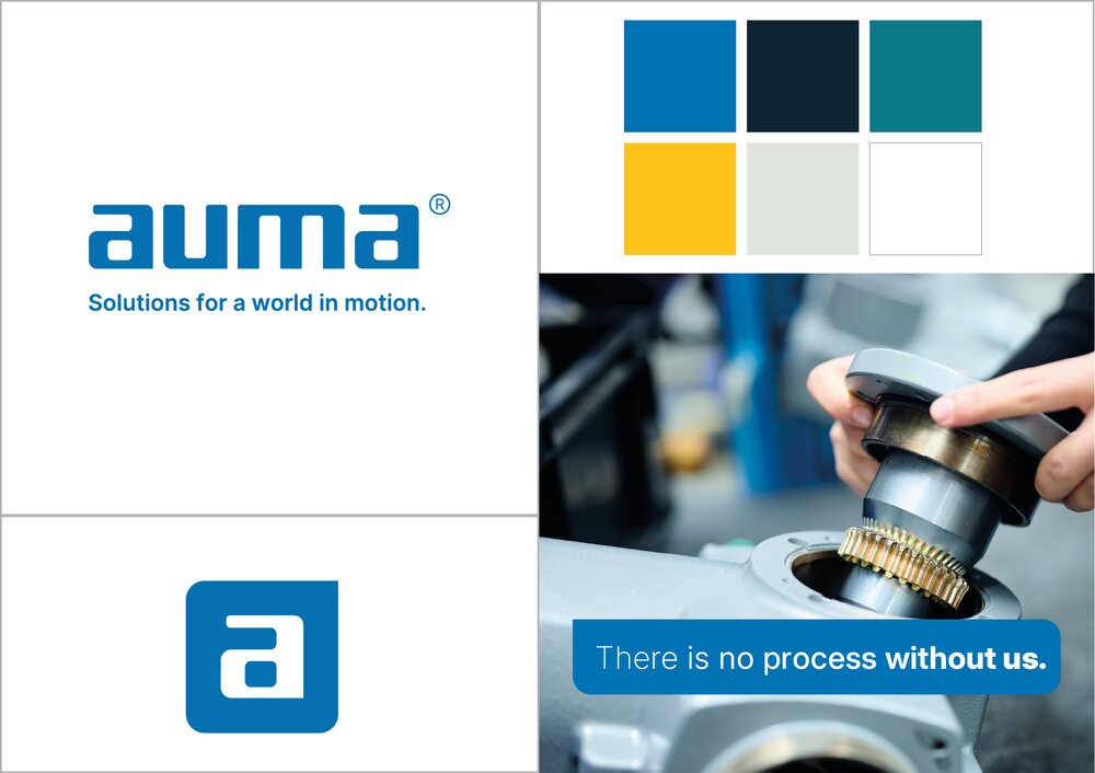
AUMA has revised its visual appearance and now presents itself in a modernised corporate design. The new corporate design reflects the strong AUMA brand identity, reliability – safety – stability, and is the visual state-of-the-art representation of AUMA's market leadership in the field of electric actuators.
AUMA combines innovation with continuity, retaining essential core elements of the previous visual appearance. AUMA has remained true to the blue colour but has added additional shades that can be harmoniously combined with blue. The logo has undergone a subtle modernisation process: In addition to the AUMA word mark, a compact short logo was also developed. New design elements have been added that will enhance the brand image in the future. The new graphic design concept creates a modern appearance through the interplay of all components.
"When AUMA had last defined a corporate design around twenty years ago, the conditions were completely different. A digital and globally orientated world required us to further develop our visual appearance. We have created a modern and future-proof corporate design that creates identity and can be used flexibly at the same time", states Michael Herbstritt, Project Manager for Corporate Design.
The corporate design will be introduced with immediate effect and will be further developed in a step-by-step process.

09.02.2026